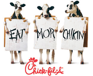
Message? * Eat chicken, not me! My eye? * To the middle, and the red. This is probably a bit of a bad choice on the advertisers part. My eye goes down, wouldn't it be better up? Sort-of leads me off the page. Contrast? * Fabulously. It definitely pulls out from the black and white. I think this happens in general. Alot of adds use black and white with one color. Printing wise, it's cheaper....and it definitely does a great contrast - especially with a bold color. Have you guys seen many ads using this style?
Aware? * Eye-catching colors...and humor. Throw a cow in any add, and you have my attention. Remember the Milk-shake commercial by Carl's Junior, I think it was?
My eye is also attracted by the child-spelling attributed to cows, which is to arouse my sympathy--even though I know it's a spoof. But really am curious about how the ad composers picture the effects on audience in general (aside from color): I'm supposed to laugh at the idea of the anthropomorphization of cows via their stance, literacy and humanoid behavior (picketing) and this humor-appreciative response is supposed to steer me toward chicken. The implication is that I will identify with cows (Kenneth Burke) and not bother to identify with chickens. Hmmm. Maybe the idea is just to imprint the brand on my brain via the red color, in which case I think Jamie has good points above--how the red draws the eye (confirming your thesis) but does lead the reader off the page.
strangely, my eye was stuck in the middle of the page, on the cows' signs. i couldn't really steer (no pun intended) away from it. i briefly glanced above and below but found myself returning always to the middle. i'm not sure why... you'd think the red would draw the attention first and foremost.
i think the message of the ad is clear. i don't believe we're supposed to be sympathetic to the cows... they're portrayed too pathetically. although the cows obviously want our sympathy. as a vegetarian, they have mine already! but so do chickens. the message is of humor above all else. and humor draws a fondness for a product above all else.
I am a full time student going on four years at the University of New Mexico. I have taken several rhetoric classes and I am extremely interested in all sorts of rhetorical theory. From classical rhetoric to Kenneth Burke, there are countless ways to be submerged into this subject.


3 comments:
Message?
* Eat chicken, not me!
My eye?
* To the middle, and the red. This is probably a bit of a bad choice on the advertisers part. My eye goes down, wouldn't it be better up? Sort-of leads me off the page.
Contrast?
* Fabulously. It definitely pulls out from the black and white. I think this happens in general. Alot of adds use black and white with one color. Printing wise, it's cheaper....and it definitely does a great contrast - especially with a bold color. Have you guys seen many ads using this style?
Aware?
* Eye-catching colors...and humor. Throw a cow in any add, and you have my attention. Remember the Milk-shake commercial by Carl's Junior, I think it was?
My eye is also attracted by the child-spelling attributed to cows, which is to arouse my sympathy--even though I know it's a spoof. But really am curious about how the ad composers picture the effects on audience in general (aside from color): I'm supposed to laugh at the idea of the anthropomorphization of cows via their stance, literacy and humanoid behavior (picketing) and this humor-appreciative response is supposed to steer me toward chicken. The implication is that I will identify with cows (Kenneth Burke) and not bother to identify with chickens. Hmmm. Maybe the idea is just to imprint the brand on my brain via the red color, in which case I think Jamie has good points above--how the red draws the eye (confirming your thesis) but does lead the reader off the page.
strangely, my eye was stuck in the middle of the page, on the cows' signs. i couldn't really steer (no pun intended) away from it. i briefly glanced above and below but found myself returning always to the middle. i'm not sure why... you'd think the red would draw the attention first and foremost.
i think the message of the ad is clear. i don't believe we're supposed to be sympathetic to the cows... they're portrayed too pathetically. although the cows obviously want our sympathy. as a vegetarian, they have mine already! but so do chickens. the message is of humor above all else. and humor draws a fondness for a product above all else.
Post a Comment